Case study: Order products from the cafe in advance
 Andrej MarfiakUX/UI Design, Case studies

Introduction
Cafeco is a local cafe located in a suburban area. They are offering a variety of products and trying to target younger/middle-aged and busy people, who don‘t have time to prepare products on their own.
Based on the user research we find out that people mainly face the same problem - the amount of time spent waiting in line for a product to order and collect. So, we have decided to conduct UX research to come up with a solution of allowing users to order products in advance and skip the waiting line.
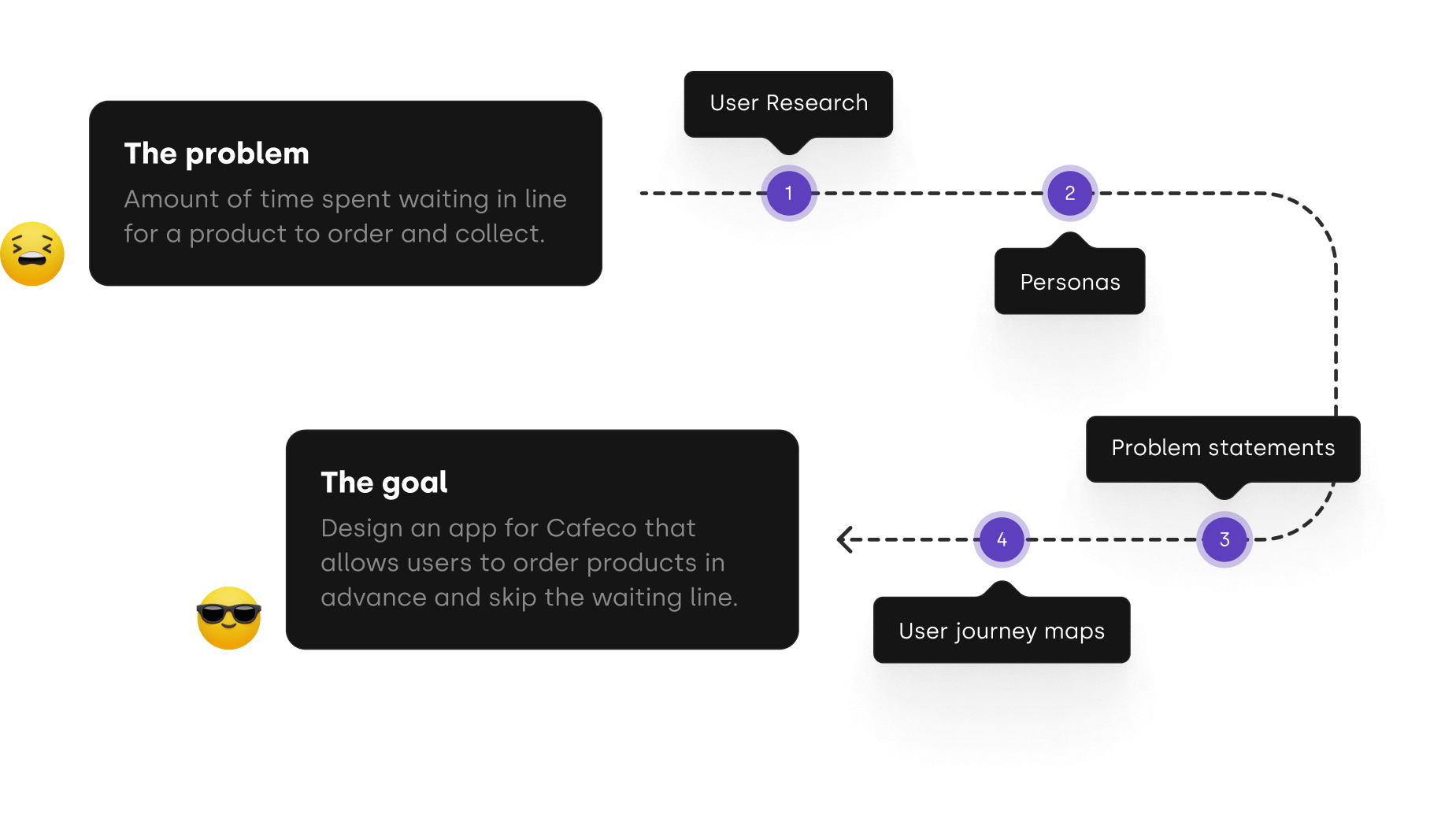
Summary of user research
Conducting the research and creating empathy maps helped us understand users' needs. The main issue for users was lack of time and the fact, that they did not want to wait in line for products.
It was not all about lacking the time and need for a faster process. These people are really enjoying their coffees and the products that are offered by Cafeco are meeting their exact needs, but often frustration stopped a lot of people from enjoying them.
Pain points
Lock of time
People nowadays are too busy to wait in line for products.
Missing app
People visiting coffee houses do not have apps to order something from their favorite place.
No rewards
Even though people visit the same coffee house, they are not getting any rewards.
Persona Amy

About Amy
“If I don’t start my day with a cup of nice coffee, I will be unbearable.”
Amy is a 40-year-old single mother living in Brno, Czechia. She has a 7-year-old daughter. She is working as an accountant in an international corporate. She has really stressful job and does not have much free time.
Goals
- To enjoy a nice cup of coffee on a regular basis
- Visit the coffee house as often as possible
- To have more free time
Frustrations
- Not enough time
- Afraid of not getting high-quality coffee
Problem statement
Amy is a busy accountant who needs to get a cup of coffee as fast as possible because she does not have much free time.
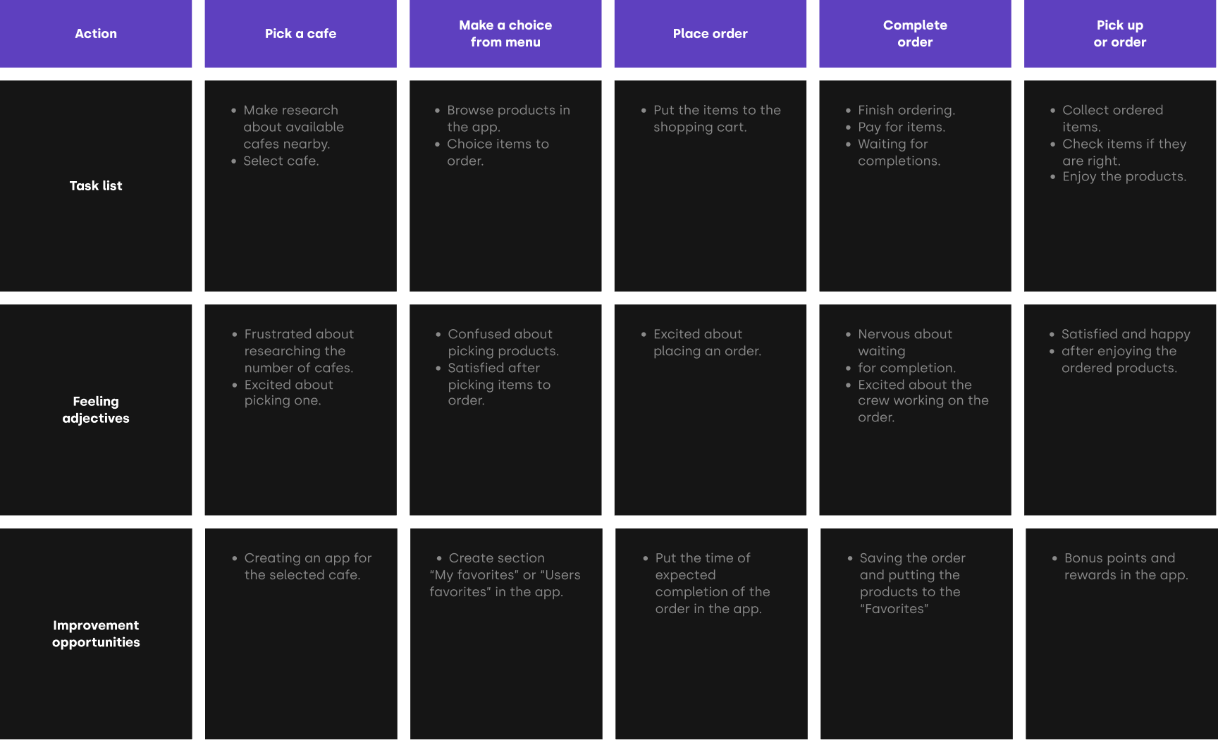
User journey map
Mapping Amy‘s user journey revealed how helpful would it be for users to use Cafeco app for mobile ordering.
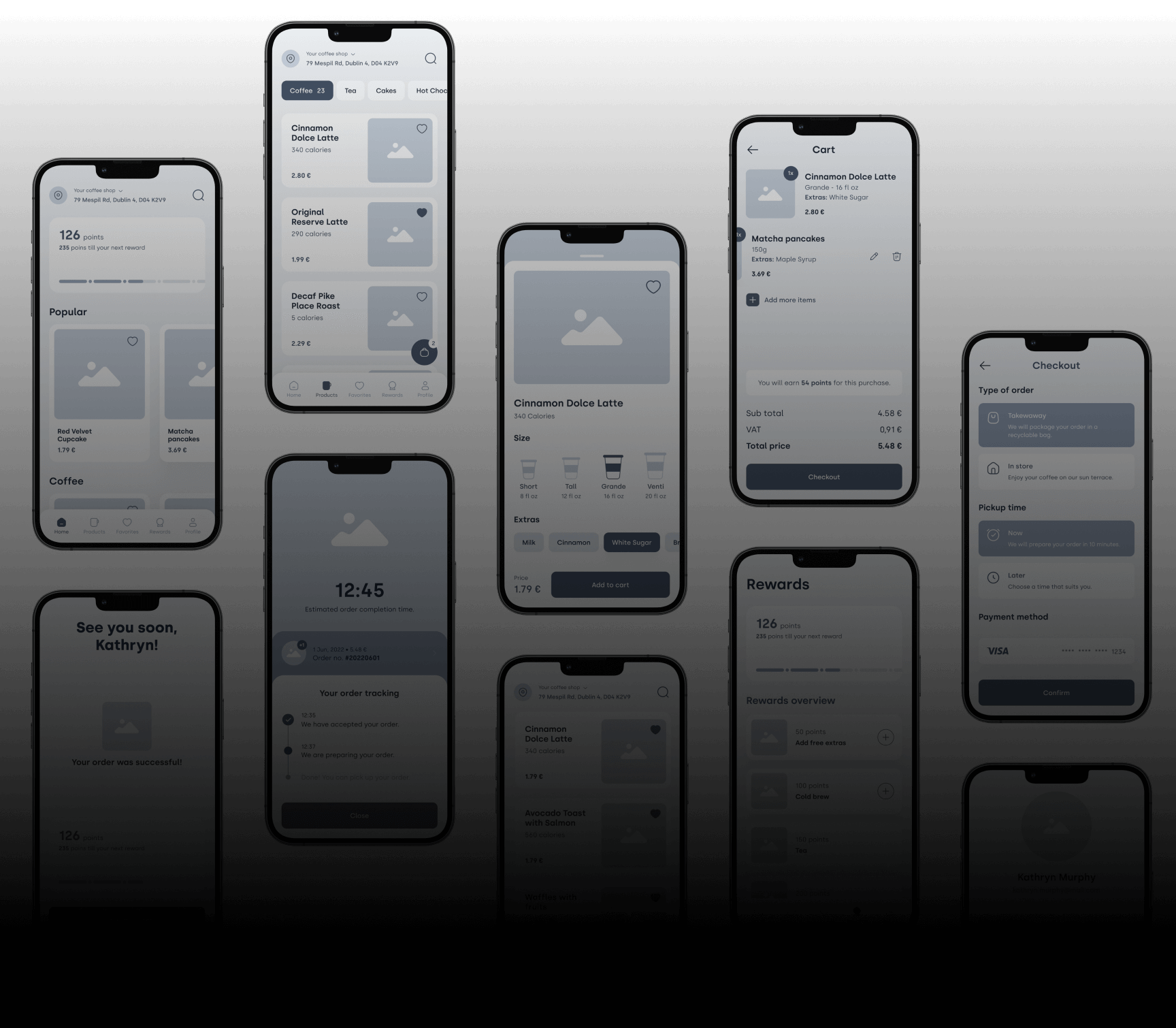
Wireframes and usability study
We have created wireframes and conducted user testing to ensure we found the perfect solution for the users. During the user testing, critical things were discovered that helped to general user flow. These discoveries were then incorporated into the designs.
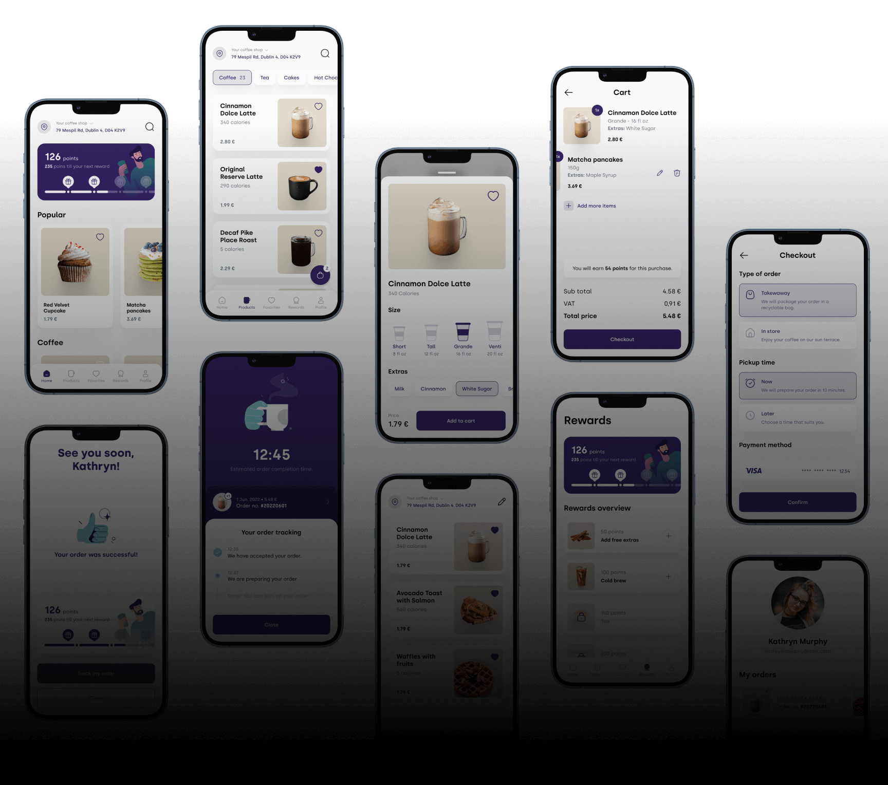
Final design
After finalizing wireframes we dived into making the app's user interface design. We chose neutral colors of violet, supported by brown colors on coffee thumbnails to represent the taste and smell of coffee.
 Andrej Marfiak